Another new look
2 comments
2 comments
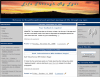
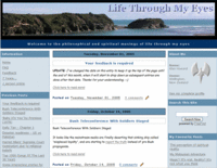
I decided to get away from the colours of the old site, which started off with the energising oranges and yellows of the sunset and then to shades of grey... How boring. This new site starts off with the pleasant view of the ocean, followed by more shades of blue, leaving you (me?) with a feeling of relaxation, calm and peace. Which is a much nicer feel, to me, than it used to be.
For posterity - and bad memories - here is the old next to the new.


I think it looks much more professional too... I'm very happy with it!
Oh, and the new picture is also mine, and you can find it here. It's part of this series of photos I took last year.
Categories: Website
For posterity - and bad memories - here is the old next to the new.


I think it looks much more professional too... I'm very happy with it!
Oh, and the new picture is also mine, and you can find it here. It's part of this series of photos I took last year.
Categories: Website
Posted on 10/15/2005 11:41:00 AM
If you have found value in what Alan (the author) has given you, please leave a donation for him so you can enjoy the spirit of giving too.


