Welcome to the philosophical and spiritual musings of...
Blogging Dating Politics Relationships Personal Development Spirituality
 

Friday, January 06, 2006

Another new change

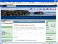
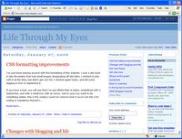
You might have noticed this site has changed its appearance again. I woke up this morning and decided to do something. Here it is. It only took me 7 hours. Not bad.

Any feedback?

UPDATE: Here's screenshots of the old related to the new, to show the difference better.

Posted on 1/06/2006 04:52:00 PM


If you have found value in what Alan (the author) has given you, please leave a donation for him so you can enjoy the spirit of giving too.

5 Comments:

Anonymous Anonymous said...

Do you want me to be honest? :)

I don't like it. It's too plain and the adverts as a third column is a real turn off.

Sorry, but you did ask. You previous layout was great.

1/09/2006 03:54:00 PM  
Blogger Alan Howard said...

I do appreciate the honest feedback! However, yours has been the only - so far - negative feedback about it. I've had 3 or 4 others tell me via IM that they like it.

Could you tell me why the adverts is a turn off for you? Does it detract from the quality of content for you?

I understand completely that the site seems too plain, but do you have any suggestions how it can be improved without going back to the old look? What I didn't like about the old appearance was that it felt too cluttered, too busy. I'll include the old appearance above next to the new appearance, just so it's easy to compare.

1/09/2006 04:00:00 PM  
Anonymous Anonymous said...

The actual blog section feels squashed. When the page first loads, I can see what it would be like with two columns and it looks roomier.

Then the ads load and it makes me groan. For the amount of money they earn you, I don't think it's worth the space. That's a personal thing, however, because I feel we're being overtaken with ads everywhere we look.

1/09/2006 04:15:00 PM  
Anonymous Anonymous said...

Now that I've seen both layouts in a short period of time, I think the clutter comes from the three columns.

At the moment, I'm using 800x600 resolution and that's why, I think, the new layout feels so squashed up. The third column on the old layout isn't even seen by my browser which was no loss (for me).

Three columns and the resolution means very skinny blogging space.

1/09/2006 04:31:00 PM  
Blogger Alan Howard said...

Screen resolution of visitors:

640x480 - 0.29%
800x600 - 11.27%
1024x768 - 41.07%
higher resolutions - 32.09%
unknown - 15.28%

Unfortunately, the majority of visitors are using 1024x768, and that's what most websites these days are designed for. I recommend that you increase your screen resolution to 1024x768. Sites won't look so cramped to you then.

I've taken your comments to heart, however, and removed the advertising. I've also made the 3rd column to show comments on the page/s.

1/09/2006 05:14:00 PM  

Post a Comment


(C) Alan Howard 1998 - 2006